How do I present server-side validation errors so screen readers and form fields stay in sync?
Map server-returned field errors into inline messages, pair them with a page-level summary, and choose a focus policy that helps screen reader users recover without losing their place.
When a form is validated on the server, the hard part is not deciding whether the submission failed. The hard part is presenting that failure so the user can repair it without losing context, and so assistive technology receives the same structure the visual UI does.
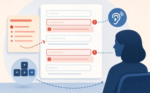
The pattern in this article uses three layers at once: a structured field-error payload from the server, inline messages tied to each control with aria-describedby, and a concise summary at the top of the page that can be announced through a live region. That combination lets the form stay legible after submit, after partial repair, and when the problem is not tied to a single field.
The W3C guidance on validation and notifications supports that split: validate on the server, keep error text concise and actionable, list problems before the form, link each item back to its control, and move focus only when that helps the next repair.
The problem is not the error message itself
A server-validated form has a different problem from a purely client-side form: the browser cannot assume the current field values are authoritative, and the response may contain several errors at once. That means the interface has to preserve the user’s input, show which fields are wrong, and still tell screen reader users that something changed after submission.
The safest pattern is to treat server validation as a structured result, not as a single banner string. Each field error needs a stable name and a concise message. The form then maps that data to the control, the inline message, and a summary that helps the user scan the whole problem set before deciding where to start.
The W3C guidance supports that split. Validation guidance makes clear that client-side checks are not enough and that server-side validation still matters. The notifications guidance then explains how to surface those results: list errors at the top, reference the field label, provide an in-page link, and connect the inline message with aria-describedby so the control and the explanation stay linked.
// Exports a small, deterministic model of applying server-side validation results
// to an accessible form state. This is a pure, side-effect-free implementation
// suitable for unit testing. It is NOT a browser DOM manipulation library; it
// models the minimal pieces needed for accessibility decisions (ids, labels,
// inline messages, aria-describedby relationships, the summary, and focus
// recommendation).

// FormState: {
//   fields: { [id]: { id, name, label, value, errorId?: string, errorMessage?: string } },
//   prevFocusedId?: string // id that had focus before submit (optional)
// }
// Server error payloads are expected as arrays of:
// { name: <field name>, message: <string> } for field errors
// and/or { type: 'non-field', message: <string> } for global errors.

export function makeEmptyFormState(fields) {
  // fields: array of { id, name, label, value }
  const map = Object.fromEntries(fields.map(f => [f.id, { ...f }]));
  return { fields: map };
}

export function applyServerErrors(formState, serverErrors, options = {}) {
  // options:
  //  - focusFirstError: true|false (default true) : whether to set focus to the first field error
  //  - liveRegionRole: 'alert'|'polite' (default 'alert') : how summary should be announced
  // Returns new state object: { formState, summary, liveMessage, focusTargetId }

  const focusFirstError = options.focusFirstError !== false;
  const liveRegionRole = options.liveRegionRole || 'alert';

  // clone formState
  const fs = { fields: {} };
  for (const id of Object.keys(formState.fields)) {
    fs.fields[id] = { ...formState.fields[id] };
    // clear previous inline errors (server has new canonical list)
    delete fs.fields[id].errorMessage;
    delete fs.fields[id].errorId;
  }

  const fieldErrors = [];
  const nonFieldErrors = [];

  for (const e of serverErrors) {
    if (e && e.type === 'non-field') nonFieldErrors.push(e.message);
    else if (e && e.name && typeof e.message === 'string') fieldErrors.push(e);
    else if (e && !e.name && typeof e.message === 'string') nonFieldErrors.push(e.message);
    // ignore malformed entries silently (could be logged in real app)
  }

  // Map field errors to fields by name. If multiple errors target same name,
  // concatenate messages (server could choose first only, but concatenation is deterministic here).
  const byFieldName = {};
  for (const fe of fieldErrors) {
    (byFieldName[fe.name] = byFieldName[fe.name] || []).push(fe.message);
  }

  // Assign inline error ids and messages
  for (const id of Object.keys(fs.fields)) {
    const f = fs.fields[id];
    const msgs = byFieldName[f.name];
    if (msgs && msgs.length) {
      f.errorId = `${id}-error`; // deterministic id for aria-describedby
      f.errorMessage = msgs.join(' ');
    }
  }

  // Build summary: list of { fieldId?, message, linkId? }
  const summaryItems = [];
  // Field errors in document order (fields keys order)
  for (const id of Object.keys(fs.fields)) {
    const f = fs.fields[id];
    if (f.errorMessage) {
      summaryItems.push({ fieldId: id, message: `${f.label}: ${f.errorMessage}` });
    }
  }
  // Non-field errors appended
  for (const m of nonFieldErrors) summaryItems.push({ message: m });

  const summary = summaryItems.length
    ? { heading: 'There was a problem with your submission', items: summaryItems }
    : null;

  // Live region message: concise summary text (used for screen reader announcement)
  const liveMessage = summary ? `${summary.heading}. ${summary.items.length} problem(s)` : null;

  // Focus decision
  let focusTargetId = null;
  if (summary && focusFirstError) {
    // If there is at least one field error, focus first field with an error.
    const firstFieldError = summary.items.find(i => i.fieldId);
    if (firstFieldError) focusTargetId = firstFieldError.fieldId;
    else focusTargetId = null; // summary-only errors should not move focus to a form control
  } else if (summary && !focusFirstError) {
    focusTargetId = null; // policy: announce summary only (no focus jump)
  }

  // Attach aria-describedby linking: for each field with errorId, include that id in a
  // returned mapping so an applicator can set input.setAttribute('aria-describedby', errorId).
  const describedBy = {};
  for (const id of Object.keys(fs.fields)) {
    const f = fs.fields[id];
    if (f.errorId) describedBy[id] = f.errorId;
  }

  return {
    formState: fs,
    summary,
    liveRegion: summary ? { role: liveRegionRole, message: liveMessage } : null,
    focusTargetId,
    describedBy
  };
}

export function repairField(formState, fieldId, newValue) {
  // Simulates user repairing one field locally and clears its server error only.
  // Does NOT re-run server validation. Deterministic: remove errorMessage+errorId for that field.
  const fs = { fields: {} };
  for (const id of Object.keys(formState.fields)) {
    fs.fields[id] = { ...formState.fields[id] };
  }
  if (!fs.fields[fieldId]) throw new Error('unknown field id');
  fs.fields[fieldId].value = newValue;
  delete fs.fields[fieldId].errorMessage;
  delete fs.fields[fieldId].errorId;
  return fs;
}
SourcesW3C WAI Forms: Validation (opens a new tab)W3C WAI Forms: Notifications (opens a new tab)
Use a payload that keeps field ownership explicit
The server should not return a vague paragraph such as “Please fix the form.” That puts the application in charge of rediscovering which field failed, and it makes partial repair awkward because the UI cannot tell whether one error disappeared while another remains. Instead, return a list of field errors with a name and a message, plus any non-field errors that do not belong to one control.
A practical shape is an array of objects such as `{ name: 'email', message: 'Enter a valid email address.' }` for field errors, and a separate representation for non-field problems such as quota exhaustion or an unavailable upstream service. That separation matters because the app can clear one field’s inline message without erasing the rest of the server result.
This structure also preserves user input. The browser keeps the current values in the form; the server merely adds validation metadata on top. That is the right time to explain what the user can fix immediately and what requires retrying later. It also avoids the common failure where an entire form is reset after a single bad submission, which forces a screen reader user to re-enter data that was already correct.
Connect each control to its own inline message
Each errored control needs a nearby message element with its own id, and the input should reference that id through aria-describedby. That relationship is what lets assistive technology present the instruction when focus lands on the control. The inline message should be short, specific, and tied to the fix the user can make right there.
A useful pattern is to place the error text directly after the field, mark the message container as live when it appears, and keep the label visible. The label identifies the control; the message explains the problem; the summary shows the broader picture. None of those pieces should try to do all three jobs at once.
The W3C notifications guidance also recommends that the top-of-page error list reference the labels of the corresponding fields and include in-page links. That lets the summary remain concise while still sending the user to the exact control. In practice, the summary list and the inline message should contain the same meaning, but not the same wording. The summary helps with navigation; the inline message helps with correction.
Let the focus policy follow the kind of error
When there are field errors, moving focus to the first errored control is usually helpful. The notifications guidance explicitly calls out that it can be convenient to set focus to the first invalid input after submit. That works because the user is immediately placed on the first place where editing can happen, and the field usually already has the information needed to understand the problem.
But focus movement is not the only valid response. If the form has only a non-field error, such as a server quota limit, an unavailable payment service, or a temporary network failure, there may be no control to repair. In that case, a live region announcement is usually better than forcing focus onto a field that is not actually wrong. A modal dialog is only appropriate when the message is urgent enough to interrupt the workflow and when the dialog really adds a distinct decision, not just a louder error paragraph.
This distinction prevents focus jumps after partial fixes. If the user corrects one field and resubmits, the page should not steal focus away from the place they are still working unless the new response contains a fresh first error that deserves attention. The goal is to keep the keyboard user anchored in the editing flow while still making the updated error state audible.
Treat summary announcements and inline errors as separate channels
A resilient server-error pattern uses two channels at once. The first channel is the page-level summary: a heading such as “There was a problem with your submission” followed by a linked list of field-specific items. The second channel is the inline message associated with each control. Together they give both overview and detail without repeating every sentence in two places.
For dynamic updates, the summary container should be in a live region, and W3C’s notifications guidance suggests role="alert" for that container when errors appear after submission. That makes the update noticeable to assistive technology users without requiring them to guess that the page changed. The field itself then uses aria-describedby so its own error text is read in context when the user returns to it.
This separation also helps when multiple errors exist. The summary can stay visible and stable while the user repairs one field at a time. If the server returns a new canonical list after the next submit, the UI should replace the old summary with the new one instead of stacking old and new messages together. Otherwise the user ends up with duplicate, stale, or contradictory instructions, which is exactly what server-side validation is supposed to prevent.
SourcesW3C WAI Forms: Notifications (opens a new tab)W3C WAI Forms: Validation (opens a new tab)
What to test and what not to assume
A deterministic test plan should cover the whole loop: submit invalid data, receive field errors, confirm the summary appears, verify the focus policy, and then repair one field to ensure only that field’s message clears. The important boundary is not just that an error appears, but that the remaining errors survive a partial repair and the user stays oriented.
It is also worth testing non-field failures separately. A quota error should announce itself without pretending that a particular input is wrong. A network failure should tell the user what happened and whether they can retry, but it should not clear the form or move focus to an arbitrary control. Those cases look similar in a banner, but they behave differently for keyboard and screen reader users.
The pattern has limits. If the form performs instant client-side checks as the user types, the live region can become noisy unless it is carefully throttled. If the server rewrites values as well as validation messages, then the application must explain the rewrite and preserve the user’s original entry history. The accessible pattern is resilient because it separates ownership: the server owns the verdict, the UI owns the presentation, and the user keeps control of the editing flow.
import test from 'node:test';
import { strict as assert } from 'node:assert';
import { makeEmptyFormState, applyServerErrors, repairField } from './main.mjs';

// Arrange a canonical form fixture used independently in each test.
function makeFixture() {
  return makeEmptyFormState([
    { id: 'email', name: 'email', label: 'Email address', value: '' },
    { id: 'password', name: 'password', label: 'Password', value: '' },
    { id: 'bio', name: 'bio', label: 'Short bio', value: '' }
  ]);
}

test('success case: two field errors => inline messages, summary, focus first errored control, aria-describedby mapping', () => {
  const fs = makeFixture();
  const serverErrors = [
    { name: 'email', message: 'Enter a valid email.' },
    { name: 'password', message: 'Password must be at least 12 characters.' }
  ];

  const result = applyServerErrors(fs, serverErrors, { focusFirstError: true });

  // Inline messages attached to fields
  assert.equal(result.formState.fields.email.errorMessage, 'Enter a valid email.');
  assert.equal(result.formState.fields.email.errorId, 'email-error');
  assert.equal(result.formState.fields.password.errorMessage, 'Password must be at least 12 characters.');
  assert.equal(result.formState.fields.password.errorId, 'password-error');
  // Unrelated field has no error
  assert.equal(result.formState.fields.bio.errorMessage, undefined);

  // Summary must exist and list the two field errors in document order
  assert.ok(result.summary);
  assert.equal(result.summary.items.length, 2);
  assert.equal(result.summary.items[0].fieldId, 'email');
  assert.equal(result.summary.items[1].fieldId, 'password');

  // Live region message is present and uses the alert role by default
  assert.equal(result.liveRegion.role, 'alert');
  assert.ok(result.liveRegion.message.includes('problem'));

  // Focus target should be the first errored control (email)
  assert.equal(result.focusTargetId, 'email');

  // describedBy mapping is consistent with inline error ids
  assert.deepEqual(result.describedBy, { email: 'email-error', password: 'password-error' });
});

test('boundary/failure case: server returns a non-field error (quota) => no field focus, summary-only announced', () => {
  const fs = makeFixture();
  const serverErrors = [
    { type: 'non-field', message: 'Quota exceeded. Try again later.' }
  ];

  const result = applyServerErrors(fs, serverErrors, { focusFirstError: true });

  // No inline field errors should be present
  assert.equal(result.formState.fields.email.errorMessage, undefined);
  assert.equal(result.formState.fields.password.errorMessage, undefined);

  // Summary exists with a single non-field item
  assert.ok(result.summary);
  assert.equal(result.summary.items.length, 1);
  assert.equal(result.summary.items[0].message, 'Quota exceeded. Try again later.');
  assert.equal(result.summary.items[0].fieldId, undefined);

  // Focus policy: since there are no field errors, do not move focus to a control
  assert.equal(result.focusTargetId, null);

  // Live region should announce the summary so screen reader users are notified
  assert.ok(result.liveRegion && result.liveRegion.message);
});

test('repairing one field clears its inline message without losing other field errors', () => {
  const fs = makeFixture();
  const serverErrors = [
    { name: 'email', message: 'Enter a valid email.' },
    { name: 'password', message: 'Password must be at least 12 characters.' }
  ];
  const initial = applyServerErrors(fs, serverErrors, { focusFirstError: true });

  // User fixes email locally (simulate typing an address)
  const afterRepairState = repairField(initial.formState, 'email', 'user@example.com');

  // The repaired field should have no server error metadata
  assert.equal(afterRepairState.fields.email.errorMessage, undefined);
  assert.equal(afterRepairState.fields.email.errorId, undefined);
  assert.equal(afterRepairState.fields.email.value, 'user@example.com');

  // The other field's error must remain untouched
  assert.equal(afterRepairState.fields.password.errorMessage, 'Password must be at least 12 characters.');

  // If the app re-applies server errors after a subsequent submit, the summary should only list remaining problems
  const nextResult = applyServerErrors(afterRepairState, [ { name: 'password', message: 'Password must be at least 12 characters.' } ]);
  assert.ok(nextResult.summary);
  assert.equal(nextResult.summary.items.length, 1);
  assert.equal(nextResult.summary.items[0].fieldId, 'password');
});
SourcesW3C WAI Forms: Validation (opens a new tab)W3C WAI Forms: Notifications (opens a new tab)