Why does `text-overflow: ellipsis` fail inside a flex row?
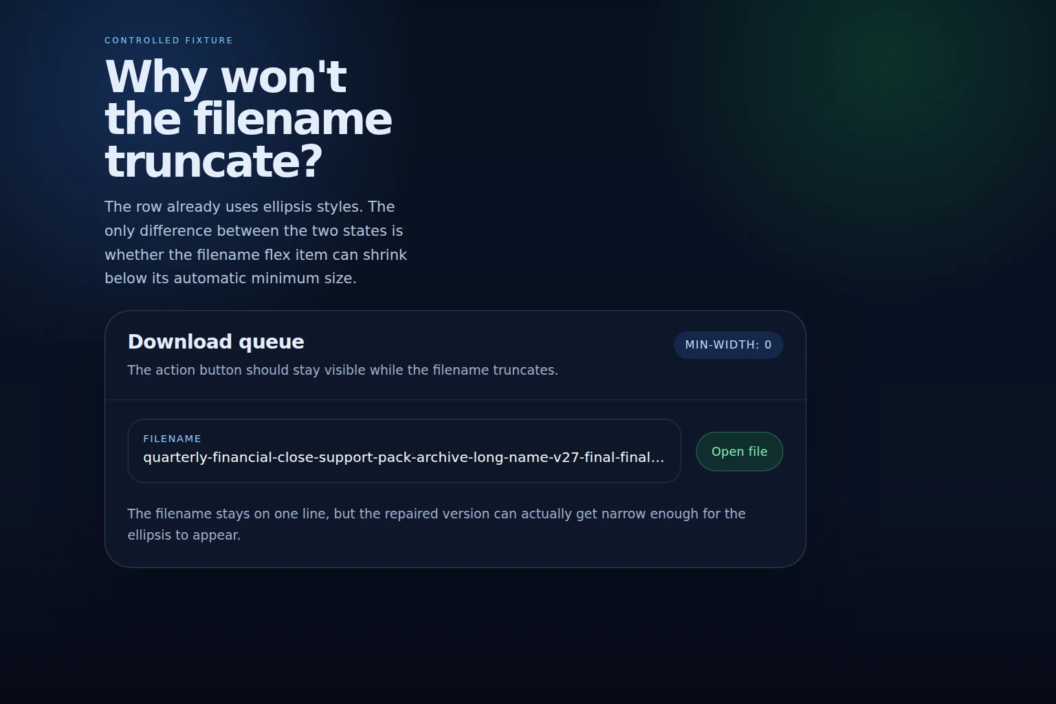
Set `min-width: 0` on the shrinking flex item so the filename can clip instead of forcing the row open.
A flex row can look ready for truncation and still refuse to show an ellipsis. The text has `overflow: hidden`, `white-space: nowrap`, and `text-overflow: ellipsis`, yet the long filename keeps stretching the row and pushes the action button away. The bug is confusing because the text styling looks complete. The missing piece is not the ellipsis rule itself. It is the flex item’s automatic minimum size.
This article isolates that failure in a small card-row fixture and shows why `min-width: 0` changes the result. The goal is not to turn every flex item into a truncation container. The goal is to explain why a flexible child can still protect its content width unless you explicitly let it shrink, and how to prove that the repair works with a repeatable browser test.
The subtlety is that the browser is not ignoring `flex: 1` or `text-overflow`. It is following the default sizing rule that tries to keep content legible by preserving the item’s min-content width. That rule is useful for readable prose and dangerous for single-line labels. Once the row contains a long unbroken token, the auto minimum size can be wider than the space the card actually has, so the layout solves the conflict by widening the row instead of truncating the text.
That means two nearby fixes are easy to confuse. `min-width: 0` changes the flex item’s floor. `overflow: hidden` on the text node changes whether overflow can be clipped. You usually need both together for a one-line filename label, and the article keeps those responsibilities separate so the reader can see which declaration fixes which part of the failure.
Reproduce the row that refuses to truncate
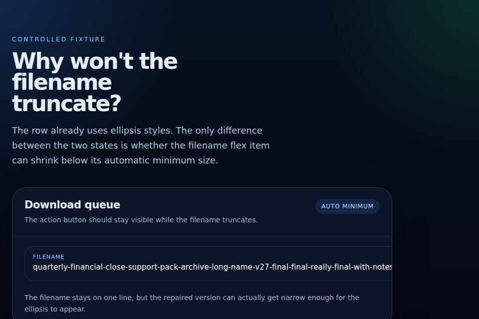
The easiest way to see the bug is to build a card with a filename on the left and an action button on the right. In the broken state, the filename has the right text styles, but the row still expands to fit the full string. The button stays visible only because the whole card gets wider instead of letting the text clip.
That is the failure the reader should recognize. The text is not missing an ellipsis because `text-overflow` is wrong. It is missing an ellipsis because the flex item never becomes narrow enough for overflow to happen in the first place.
In a product UI this usually shows up in one of two ways: the label row stretches the card wider than the design system intended, or the action control gets pushed off the visible edge and looks like it disappeared. Both outcomes come from the same cause. The item with the long text is still being sized as if the browser should preserve the full label width, even though the design expects the label to give up space.
SourcesMDN: text-overflow (opens a new tab)MDN: flex (opens a new tab)
Why the flex item keeps its content width
By default, flex items do not shrink below their min-content size. That automatic minimum size is useful when the browser should protect content from being crushed, but it is exactly what gets in the way when a row is supposed to truncate a long label.
The key point is that `text-overflow` does not create the shrinking behavior. It only signals that overflow is being clipped. If the item remains wide enough to fit the whole filename, there is nothing to signal, so the ellipsis never appears.
That is why this bug often hides in plain sight. The layout appears to be a standard one-line truncation pattern, but one ancestor in the flex chain is still honoring the content-based minimum width.
The reason `min-width: 0` is the right lever is that it changes the shrink floor without changing the flex distribution itself. The row can still grow when there is room, but it no longer refuses to contract when the container gets tighter. In practice, that is the difference between a design that behaves like a single-line label and one that behaves like a fixed-width sentence.
A second failure mode sits nearby: if the long text is on the wrong nested element, setting `min-width: 0` on the parent flex item may not help because the child still owns the intrinsic width. That is why the article keeps the structure minimal and assigns the truncation styles to the same element that receives the minimum-width override.
SourcesMDN: min-width (opens a new tab)CSS Flexible Box Layout Module Level 1 (opens a new tab)
Let the item shrink with `min-width: 0`
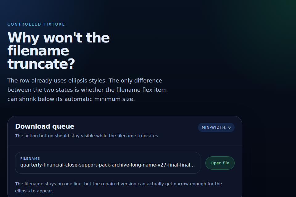
The repair is one line on the element that owns the filename: `min-width: 0`. That removes the content-based floor and lets the flexible child become narrower than its min-content size. Once the browser can narrow the item, the overflow rules finally have something to act on.
The important implementation detail is that the minimum belongs on the shrinking flex item, not on a random wrapper. If the wrong element keeps the auto minimum, the row still opens up to fit the filename and the action button remains displaced.
The code is intentionally small because the bug is local. The browser does not need a new layout algorithm, a component rewrite, or a custom text-measurement script. It needs one declaration that tells the flex item it is allowed to be narrower than the text would prefer. That is also why this repair is easy to overuse. If the label is supposed to wrap, or if the action button should drop to a second line on narrow screens, then `min-width: 0` is not the whole solution.
.row {
  display: flex;
  align-items: center;
  gap: 1rem;
}

.row__name {
  flex: 1 1 auto;
  min-width: 0;
  overflow: hidden;
  white-space: nowrap;
  text-overflow: ellipsis;
}
SourcesMDN: min-width (opens a new tab)MDN: text-overflow (opens a new tab)
Prove the difference with a browser test
The regression test uses the same fixture, the same content, and the same viewport in both states. That matters because the visible difference is only about whether the row can shrink far enough for ellipsis to happen.
In the broken case, the filename element stays wider than the available slot and the button gets pushed away. In the repaired case, the filename width drops below the card width and the text clips instead of expanding the row.
The test does not claim that every browser handles every flex and truncation edge case identically. It proves the behavior the article is about in the controlled browser used for authoring.
Run the controlled example
Load the fixture at one fixed viewport, then compare the row before and after the minimum width change.
Check geometry, not just the screenshot
Assert that the filename stays too wide in the broken version and shrinks in the repaired version while the action button remains visible.
Record the boundary
Keep a note that the local pass proves the geometry relationship, not universal behavior across every browser or assistive technology path.
| Mode | Observed result |
|---|---|
| Automatic minimum size | The long filename keeps the row open and the ellipsis does not appear. |
| min-width: 0 | The long filename shrinks, the ellipsis appears, and the button stays aligned. |
SourcesMDN: flex (opens a new tab)MDN: min-width (opens a new tab)
Know when this does not apply
This is not a rule that every flex item should get `min-width: 0`. If the item is supposed to preserve its content width, or if the text is meant to wrap instead of truncate, the fix changes the layout in the wrong direction.
The repair also does not help if the truncation styles are incomplete. `text-overflow: ellipsis` still needs the overflow and nowrap conditions to be true. If the text can wrap, or if the overflow is visible, the ellipsis will not appear even when the flex item can shrink.
The point of the article is narrower: when a flex row is supposed to truncate but the child refuses to get narrow enough, the automatic minimum size is the first thing to inspect.
There is also a browser-boundary caveat. The local Chromium pass proves the layout relationship in one engine at one viewport. It does not replace a compatibility audit for Safari, Firefox, zoom, or a component that behaves differently once text size increases. If the same row still fails after `min-width: 0`, the next places to inspect are the nested block that actually owns the text and any ancestor that is preventing the inline overflow from ever occurring.
SourcesMDN: text-overflow (opens a new tab)MDN: min-width (opens a new tab)