Why your CSS grid still overflows after min-width: 0
A download card, one long filename, and three visible states: see why shrinking a grid item and containing its content are separate fixes.
A long filename can break a simple two-column download layout. You add min-width: 0, the card snaps back into place, and it looks as though the problem is solved. Then you notice that the filename still runs across the sidebar.
This example shows the difference between a grid item that is too wide and content that spills out of a correctly sized item. Follow the three screenshots first, then use the small CSS changes to reproduce the repair. The download interface is a controlled HTML/CSS fixture, not a customer product.
01. The filename pushes the sidebar out
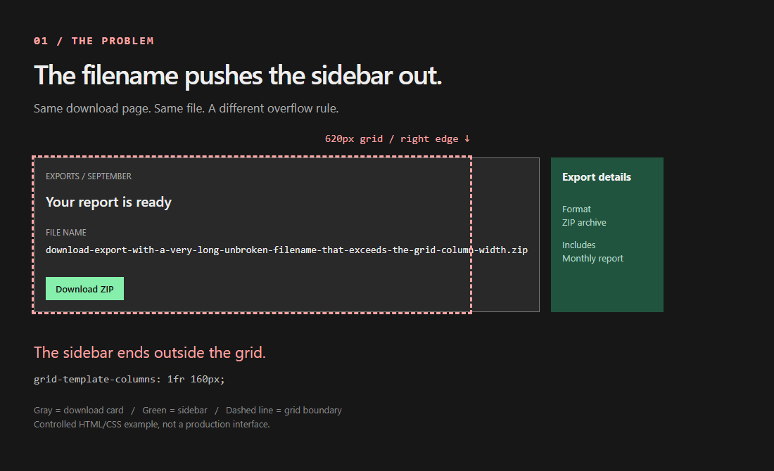
The gray download card and green export-details sidebar should fit inside the dashed boundary. Instead, the filename gives the card a large intrinsic width, pushing the whole sidebar beyond the grid's right edge. The button and headings identify the component; the unbroken filename is the content causing the failure.
The grid is deliberately fixed at 620px. After a 160px sidebar and a 16px gap, the flexible column has 444px available. The card's default minimum prevents it from fitting into that space in this example.
SourcesMDN: automatic minimum widths (opens a new tab)CSS Grid: automatic minimum size of grid items (opens a new tab)
02. The card fits, but the filename still spills
Add min-width: 0 to the direct grid item, .content. The card now measures 444px and the sidebar returns to its column. But the preformatted filename still escapes the card, passes behind the sidebar, and continues beyond the dashed grid edge. Fixing the card's width has not decided what its contents should do.
In this single-track-span fixture, a bare 1fr track and the item's automatic minimum allow content to influence the minimum size. The zero item minimum removes that sizing constraint. It does not make the descendant wrap, clip, or scroll. This explanation is specific to the example; other spans, explicit sizes, aspect ratios, and scroll containers can change the automatic-minimum calculation.
.item-only .content { min-width: 0; }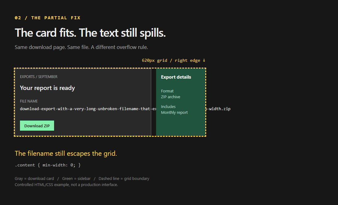
SourcesMDN: automatic minimum widths (opens a new tab)CSS Grid: automatic minimum size of grid items (opens a new tab)
03. Keep the long filename inside its own scroller
Keep the zero minimum on the card, then set overflow: auto on the pre. The two rules solve different problems: the card may shrink to fit its column, while the long filename stays available inside a scrolling region.
The download button, title, and sidebar remain outside that scroller. Nothing has been shortened or hidden to make the screenshot look clean. In this fixture the grid's scrollable width returns to 620px, while the pre's content remains wider than its visible area.
The named pre is focusable. The test checks that Tab reaches it and ArrowRight scrolls the filename. That is a focused keyboard check, not a screen-reader audit or a claim of accessibility compliance.
.fixed .content { min-width: 0; }
.fixed pre { overflow: auto; }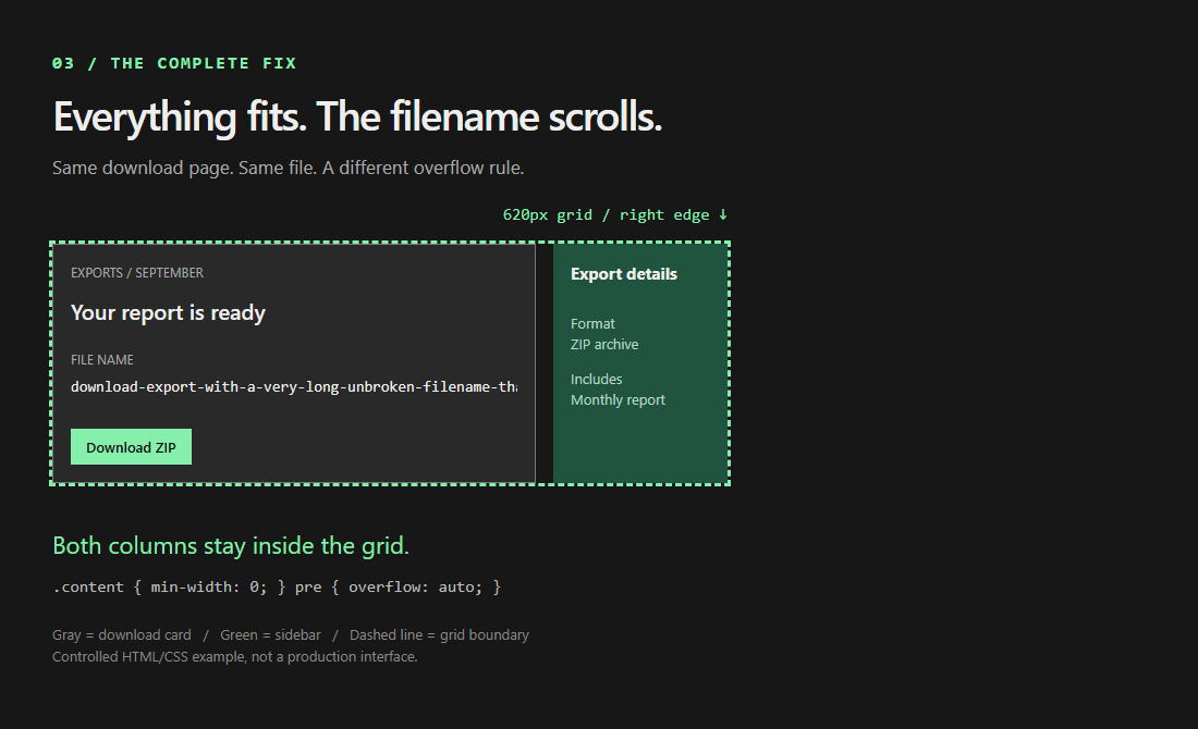
SourcesMDN: overflow and keyboard-accessible scroll containers (opens a new tab)
When to put the minimum on the track instead
The alternative state uses minmax(0, 1fr) for the first column and keeps overflow: auto on the pre. In this fixture it also contains the code and leaves the sidebar in place without the item-level min-width override.
Choose the location of the constraint intentionally. If only one card needs to shrink, the item rule is a focused change. If the layout component promises a column that can shrink below its contents, express that minimum on the track. Neither choice decides whether descendants should wrap, scroll, or clip.
.track .layout { grid-template-columns: minmax(0, 1fr) 160px; }
.track pre { overflow: auto; }| Declaration | Responsibility | Does not provide |
|---|---|---|
| min-width: 0 on the content item | Allow this item to shrink | Containment for visible overflowing text |
| minmax(0, 1fr) on the column | Remove the automatic track minimum | A wrapping or scrolling policy for descendants |
| overflow: auto on the pre | Keep the long line available in an internal scroller | A responsive layout for the fixed sidebar |
SourcesCSS Grid: automatic minimum size of grid items (opens a new tab)MDN: overflow and keyboard-accessible scroll containers (opens a new tab)
Check the incomplete fix, not just the final screenshot
The example was checked locally using Node 22.23.2, Playwright, and Chrome 152.0.7977.83 on Windows. At a 1280x900 test viewport, the assertions compare four states with the same content and a 620px grid. The table reports observations from that run, not widths guaranteed across browsers or fonts.
The item-only case is the important negative test: the card has the expected width, but the grid still has overflowing content. Both complete repairs must contain the grid and retain a scrollable filename. The test also checks keyboard scrolling and a separate 320px layout failure.
Expand the tested markup and CSS below to reproduce the example. The fixture adds its presentation styles through examples/grid.mjs. The capture script surrounds it with explanatory labels and a dashed boundary; those annotations do not change the grid sizing rules.
Run the fixture tests
node --test docs/blog/daily/2026-09-09/examples/grid.test.mjsExpand the tested download-card markup
<div class="layout">
  <div class="content">
    <p class="label">EXPORTS / SEPTEMBER</p>
    <h2>Your report is ready</h2>
    <p class="file-label">FILE NAME</p>
    <pre tabindex="0" role="region" aria-label="Export filename">download-export-with-a-very-long-unbroken-filename-that-exceeds-the-grid-column-width.zip</pre>
    <button class="download" type="button" tabindex="-1">Download ZIP</button>
  </div>
  <aside><strong>Export details</strong><p>Format<br>ZIP archive</p><p>Includes<br>Monthly report</p></aside>
</div>
Expand the complete fixture CSS
* { box-sizing: border-box; }
body { margin: 0; padding: 24px; background: #171717; color: #eee; font: 16px/1.5 system-ui; }
.layout { display: grid; width: 620px; grid-template-columns: 1fr 160px; gap: 16px; }
.content { padding: 16px; background: #292929; border: 1px solid #777; }
pre { margin: 0; font: 14px/1.5 monospace; }
aside { padding: 16px; background: #21543e; }
.item-only .content, .fixed .content { min-width: 0; }
.fixed pre, .track pre { overflow: auto; }
.track .layout { grid-template-columns: minmax(0, 1fr) 160px; }
h2 { margin: 0 0 8px; font-size: 20px; font-weight: 500; }
.label { margin: 0 0 12px; color: #aaa; font-size: 12px; }
.file-label { margin: 20px 0 6px; color: #aaa; font-size: 12px; }
.download { display: inline-block; margin-top: 28px; padding: 8px 14px; border: 0; background: #86efac; color: #111; font: 600 13px system-ui; }
aside strong { display: block; margin-bottom: 24px; font-size: 15px; }
aside p { margin: 12px 0 0; color: #b6d7c8; font-size: 13px; }| State | Item width | Grid scrollWidth | Result |
|---|---|---|---|
| Before | 719.06 | 895 | Item forces the column wider |
| Item minimum only | 444 | 702 | Item fits; text still escapes |
| Item minimum and code scrolling | 444 | 620 | Grid contained; code scrolls internally |
| Track minimum and code scrolling | 444 | 620 | Alternative contains the same content |
SourcesCSS Grid: automatic minimum size of grid items (opens a new tab)
Containment is not a responsive layout
The fixed 620px fixture still overflows a 320px viewport. A second test confirms that failure, then switches the grid to width: 100% and a single minmax(0, 1fr) column. Document-level overflow disappears in that controlled case. A real layout needs a deliberate breakpoint and reading order for its sidebar, not just a smaller minimum.
For prose or URLs, wrapping may be preferable to a horizontal scroller. For code where line structure matters, a scrollable region may be more useful. Hiding overflow solely to make a screenshot look clean can conceal content and is not the repair demonstrated here.
Firefox, Safari, screen readers, browser zoom, vertical writing modes, and nested responsive components were not verified by this fixture. Keep those checks on the release checklist. If overflow remains in an application, measure the direct grid item and its overflowing descendant separately before adding another global override.
SourcesMDN: overflow and keyboard-accessible scroll containers (opens a new tab)